
Concept
概念策划
Brand Design
品牌设计
Type Design
字体设计


蜀宫琴台品牌全案设计
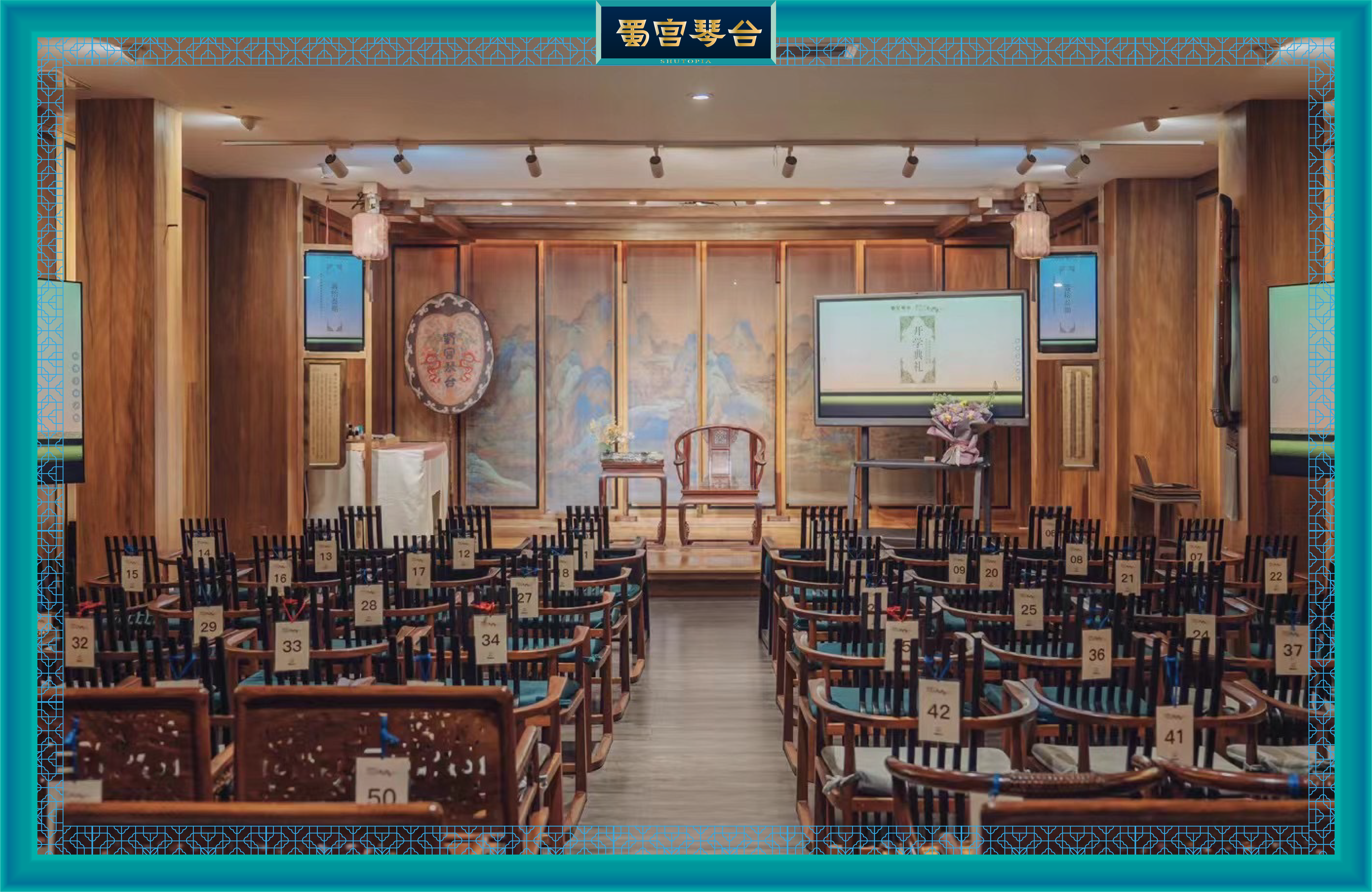
“蜀宫琴台”是一座以中国古典音乐文化为核心的文创体验馆,
坐落于成都,承载着古代文人“琴心妙道”的精神意象。
它不仅是一个沉浸式的文化空间,更是一个将古蜀文明与当代美学结合的实验场。
除琴乐演绎外,还涵盖古典妆造学习、传统宴饮体验等多样化的非遗传承项目,
逐渐形成了七大板块:乐(琴乐)、戏(戏曲)、集(雅集)、学(学堂)、锦(汉服)、造(文创)、宴(宴饮)。
在这一整体格局下,蜀宫琴台需要一套更加系统和现代化的视觉体系,
以生动传达其通过沉浸式体验与学习让古代中国美学在当代焕活的愿景。
本次全案设计包含了品牌定位策划与图形和字体的LOGO设计,以及一整套视觉系统。
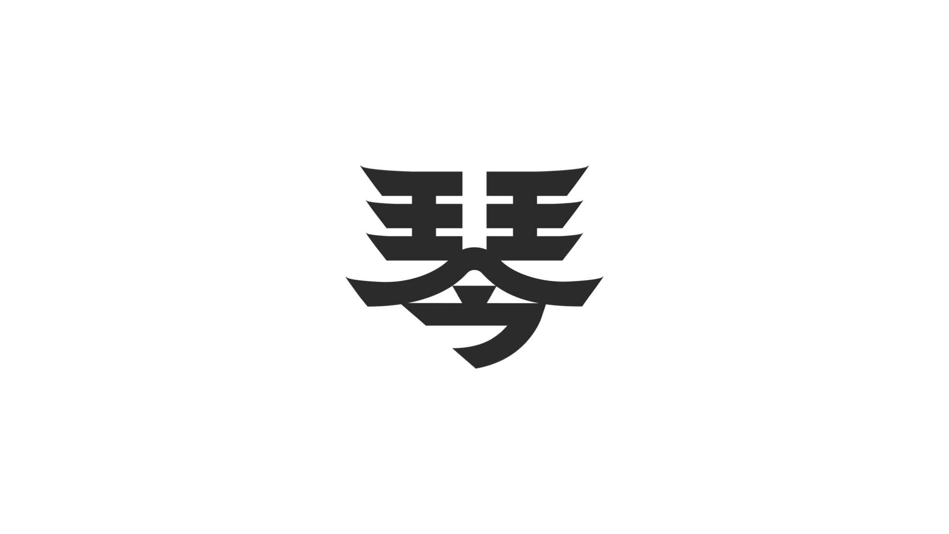
图形LOGO在原有形式基础上进行极简化处理。
它的突破性在于以最简单的笔画承载最丰富的内涵:
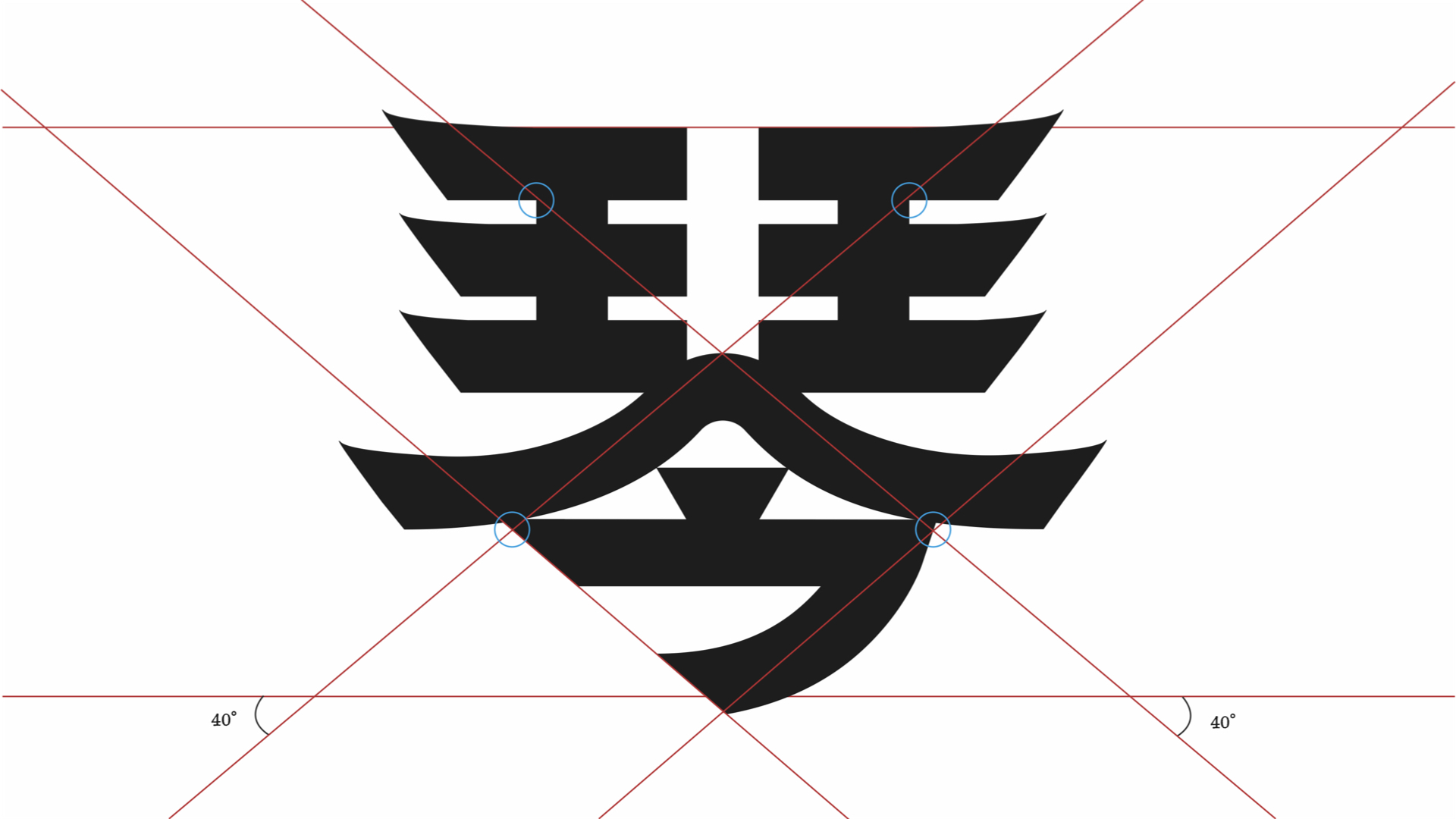
远观像一座飞檐宫殿,呼应场馆本身的建筑形态;近观又像一位酣畅弹琴之人,
传递逍遥与洒脱的精神气质;同时保留的毛笔笔触,
则赋予了自由与洒脱的视觉感受;
再一细看,图形又化为一个闭目微笑的面庞。
一个图形,两道笔画,传递六层不同含义:
1. 原有Logo形态——致敬与传承
2. 飞檐宫殿——呼应建筑空间
3. 弹琴之人——彰显文化属性
4 . 逍遥洒脱的品格
5. 含蓄满足的微笑
6. 古典与当代交融的氛围。
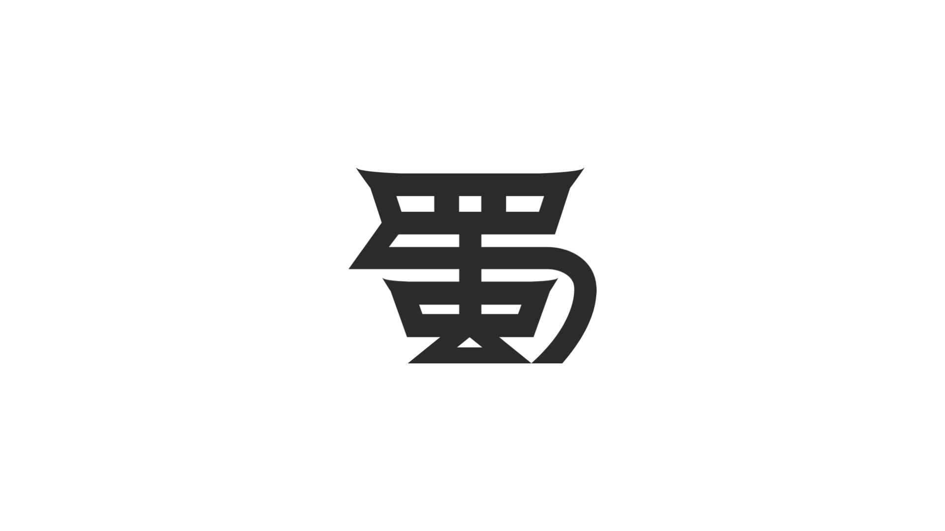
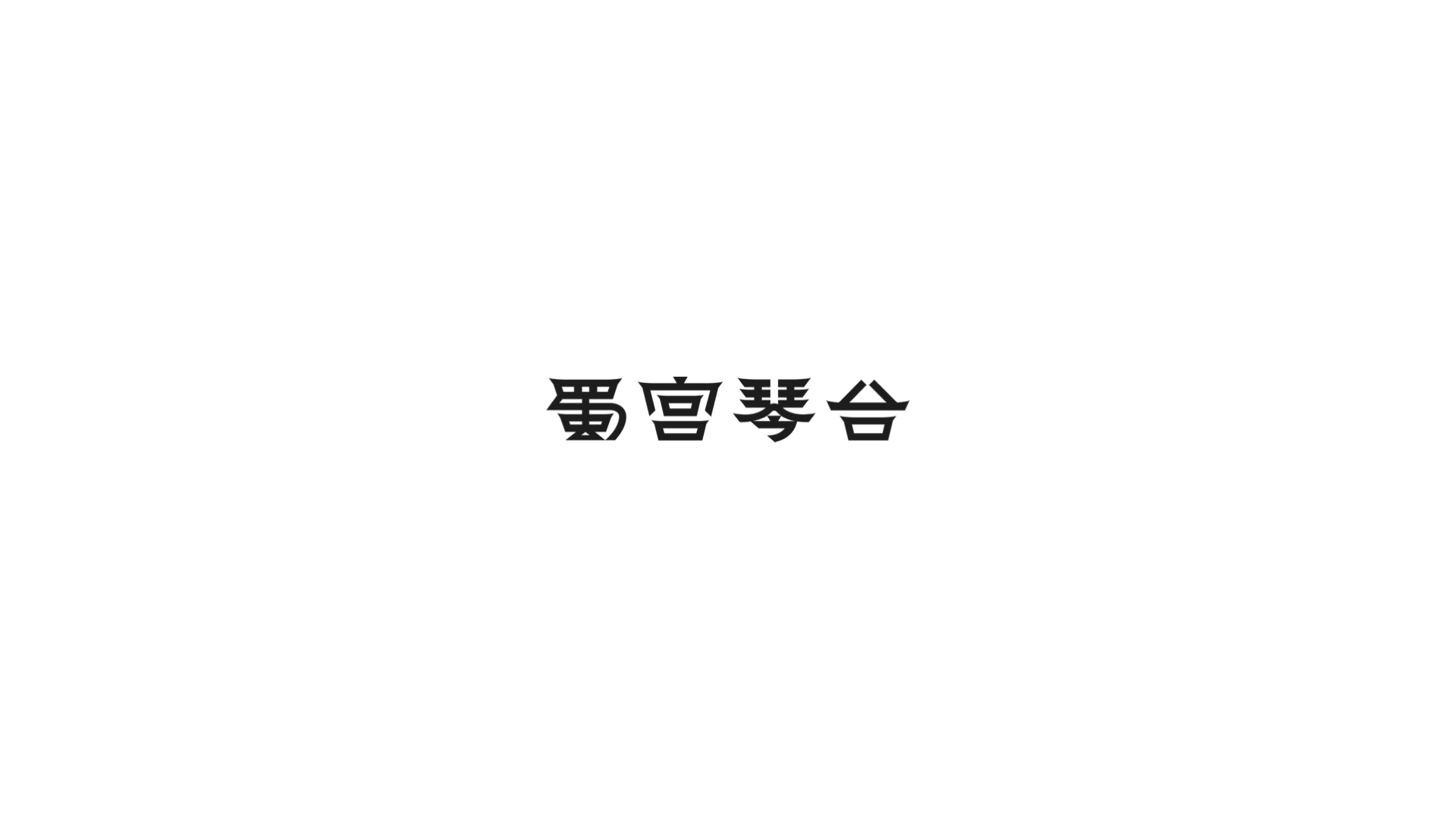
中文Logo的字体设计灵感取自宫殿飞檐,并融合三星堆与汉鼎的线条,既庄重大气,又不失当代感。
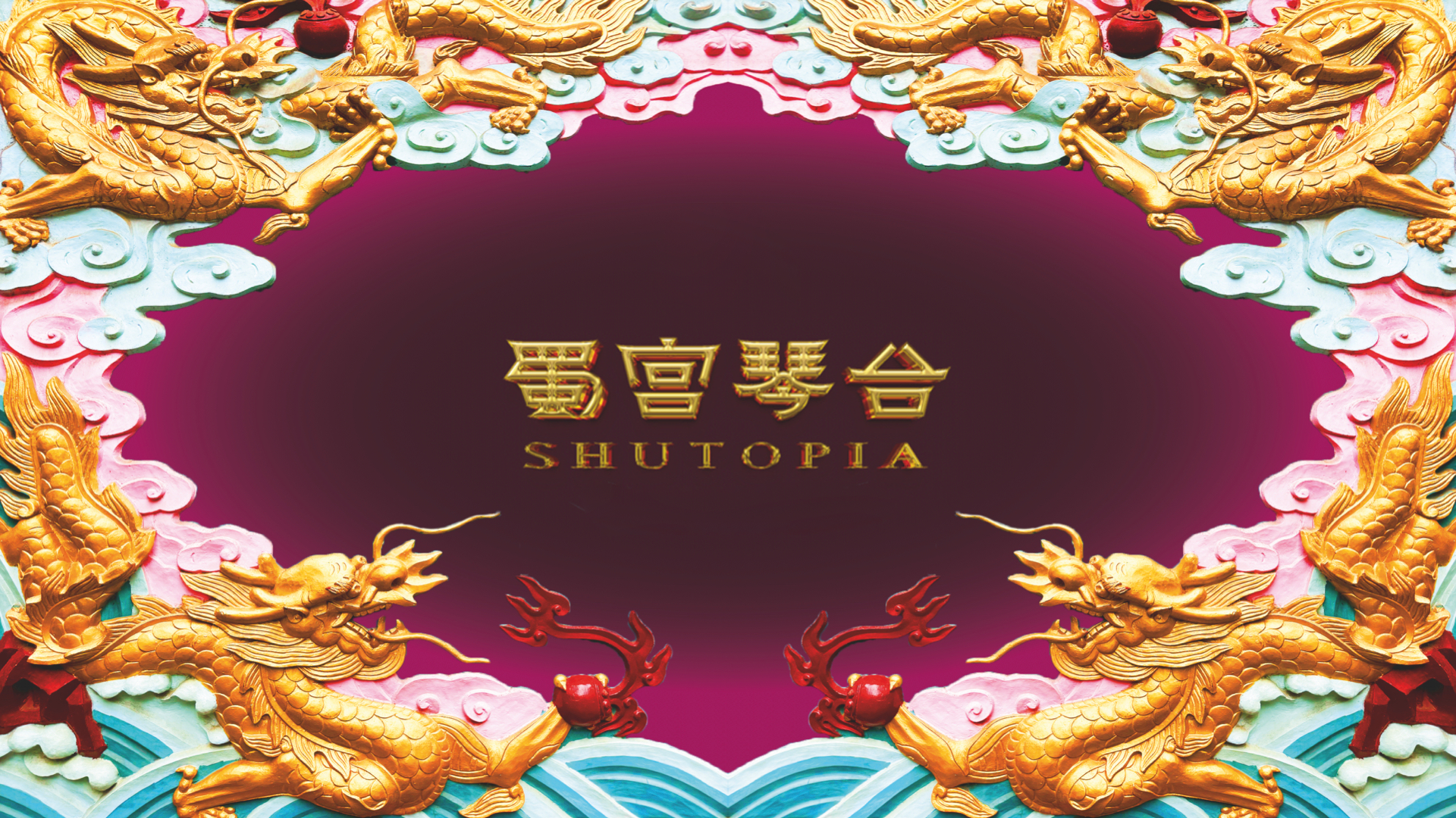
整体视觉风格则取材自上海美术电影制片厂的经典之作《大闹天宫》,
主视觉的边框更引用了成都青羊宫“福禄寿”照壁的意象,营造出古典与现代对话的独特张力。
Shutopia Brand Full-Case Design
"Shutopia" is a cultural and creative experience center centered on Chinese classical music culture.
Located in Chengdu, it embodies the spiritual imagery of the "Qin Heart and Wonderful Way" of ancient literati.
It is not only an immersive cultural space, but also an experimental field that integrates ancient Shu civilization with contemporary aesthetics.
In addition to Qin music performances, it also includes diverse intangible cultural heritage programs such as classical makeup
and makeup learning and traditional banquet experiences.
It has gradually developed seven major sections:
Music , Theatre, Gatherings (tea ceremony or flower arrangement), Sinology (schools), Brocade (Hanfu), Bespoke (Cultural product), and Banquets.
Within this overall framework, Shutopia required a more systematic and modern visual system to
vividly convey its vision of revitalizing ancient
Chinese aesthetics in the contemporary world through immersive experiences and learning.
This full-case design encompasses brand positioning planning,
logo design for graphics and fonts, and a complete visual system.
The graphic logo has been minimalized from its original form.
Its breakthrough lies in the way the simplest strokes convey rich meaning:
from a distance, it resembles a palace with overhanging eaves, echoing the venue's architectural form;
up close, it resembles a person playing the zither with great energy, conveying a carefree and unrestrained spirit.
Meanwhile, the retained brushstrokes impart a sense of freedom and uninhibitedness.
Upon closer inspection, the graphic transforms into a face with closed eyes and a smile.
One graphic, two strokes, convey six distinct meanings:
1. The original logo form—a tribute and a symbol of heritage;
2. The palace with overhanging eaves—echoing the architectural space;
3. The person playing the zither—embodying cultural attributes;
4. A carefree and unrestrained character;
5. A subtle smile of contentment;
6. An atmosphere that blends the classical and the contemporary.
The Chinese logo's font design draws inspiration from the palace's overhanging eaves,
incorporating the lines of Sanxingdui and Han Dynasty tripods to create a solemn and majestic yet contemporary feel.
The overall visual style is drawn from the Shanghai Animation Film Studio's classic work "Havoc in Heaven".
The frame of the main visual also quotes the image of the
"Fu Lu Shou" screen wall of Chengdu Qingyang Palace,
creating a unique tension in the dialogue between classic and modern.


 大闹天宫视觉灵感
 Inspirations from Shanghai Animation Film Studio's classic work "Havoc in Heaven".


